Taipei Design Award 2022 Key Visual | 臺北設計獎主視覺
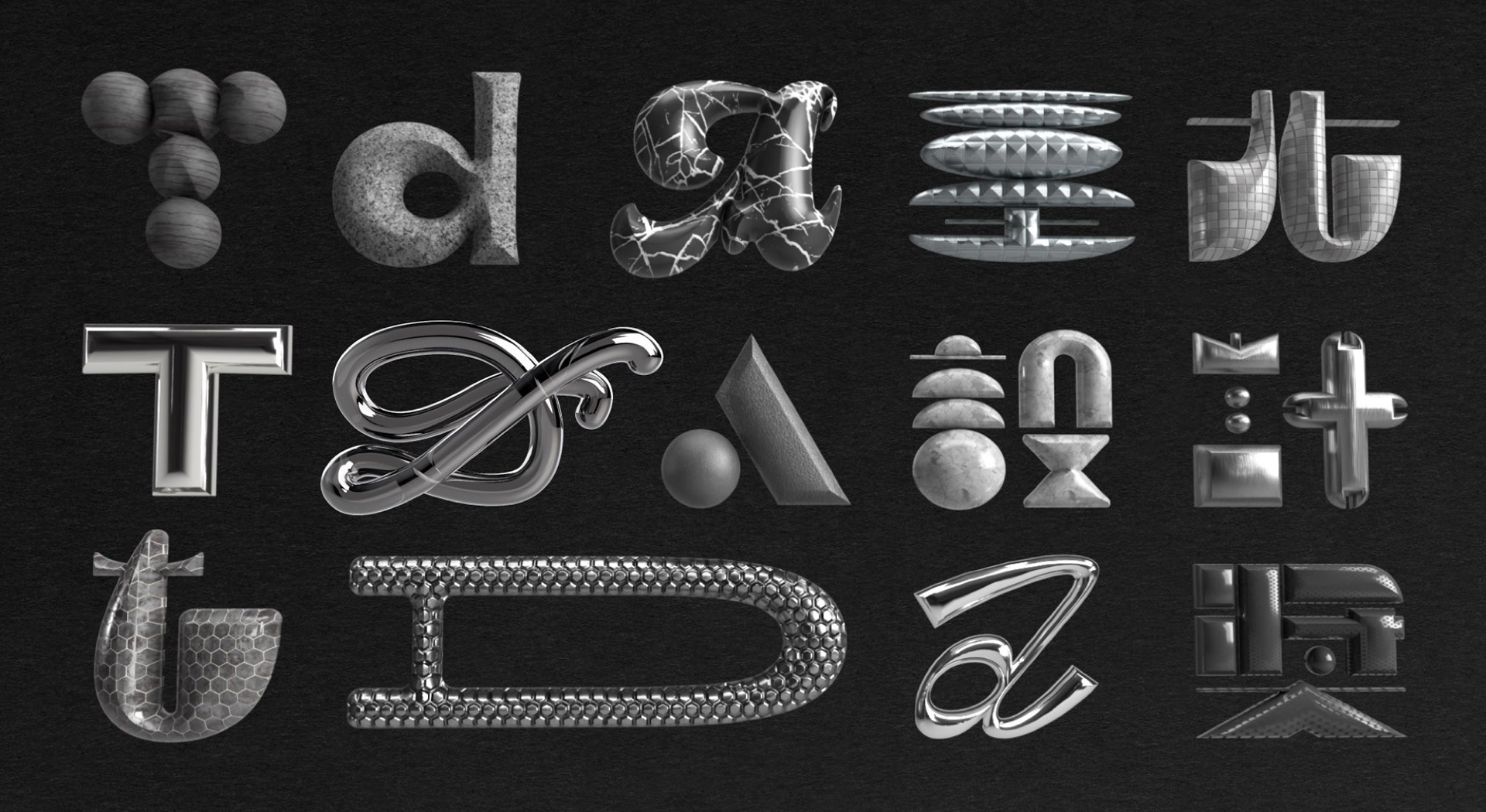
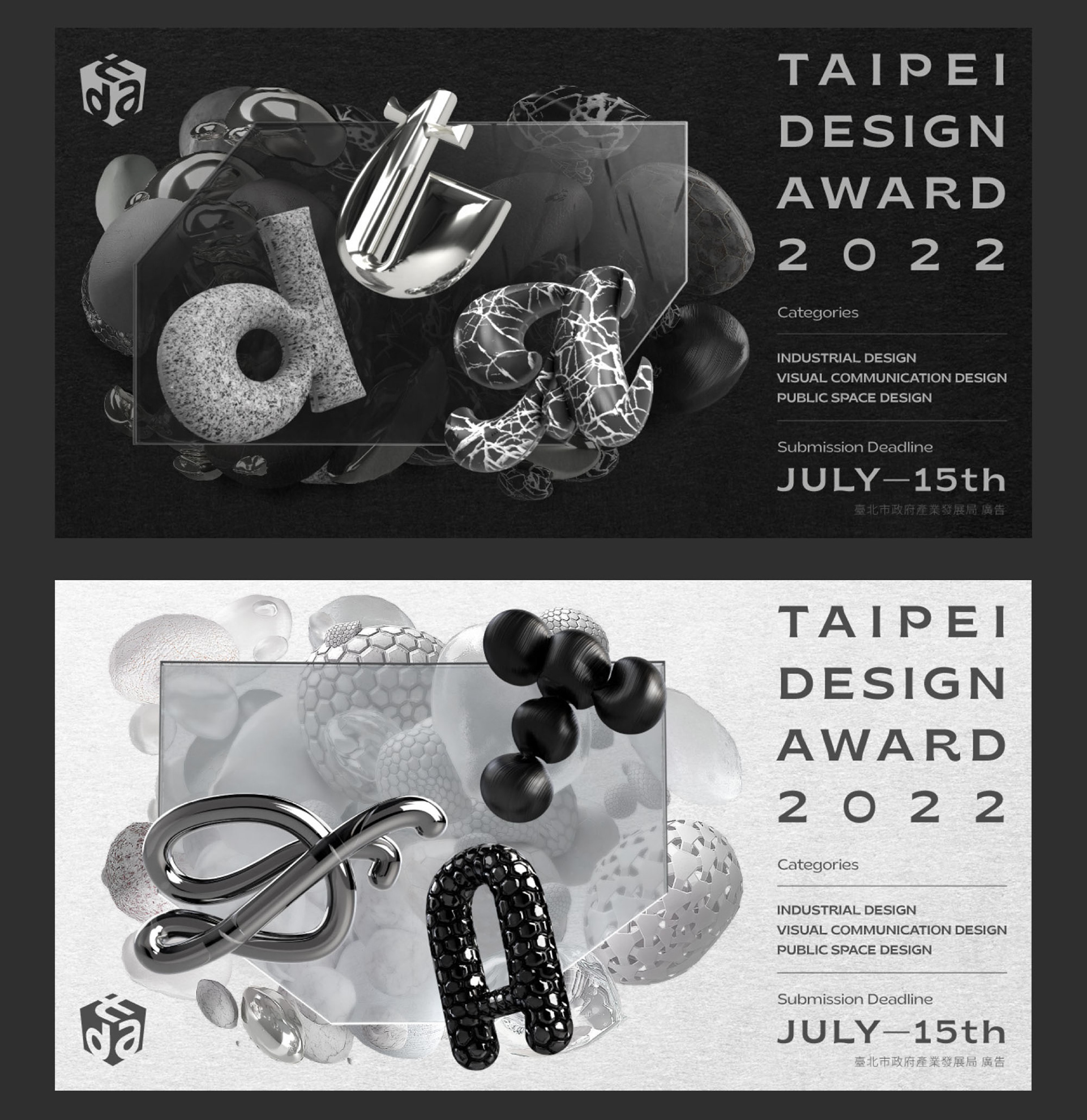
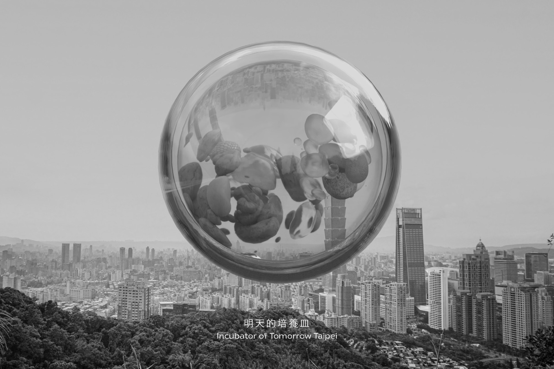
我們為第十五屆台北設計獎所設計的主視覺,以「創意混種,明日培養皿」為設計主題,將獎項標誌的黑盒子,化作不規則的六方形,並賦予命名縮寫字母獨特的變體與材質,我們也延伸設計出更多蘊含有機生命感的造型與材質變化,為主視覺留下後續發展的可能。
台北設計獎就如同台北本身一樣,不同的創意、故事和夢想,在這裡混雜相遇,在培養皿中,青澀的想法得以茁壯,跨領域的點子帶來新的觀點,最終將會實踐成明天生活的樣貌。台北設計獎不只是設計人的盛會,也是生活演化的體現,奠基於台北,朝向世界生長。
For the 15th Taipei Design Award key visual, themed “Creative Hybridization, Incubator of Tomorrow Taipei,” the iconic black cube was transformed into an irregular hexagon, with distinctive variations and materials applied to the acronym. Organic, life-like variations suggest future development. The Taipei Design Award, like Taipei itself, is a meeting place for diverse creativity, where interdisciplinary ideas thrive and shape the future. It’s both a celebration of designers and a symbol of life evolution rooted in Taipei, growing toward the world.


活動視覺的精神在於扮演品牌與溝通對象的橋樑,設計為品牌設定述說故事的角度,將品牌植入人心。
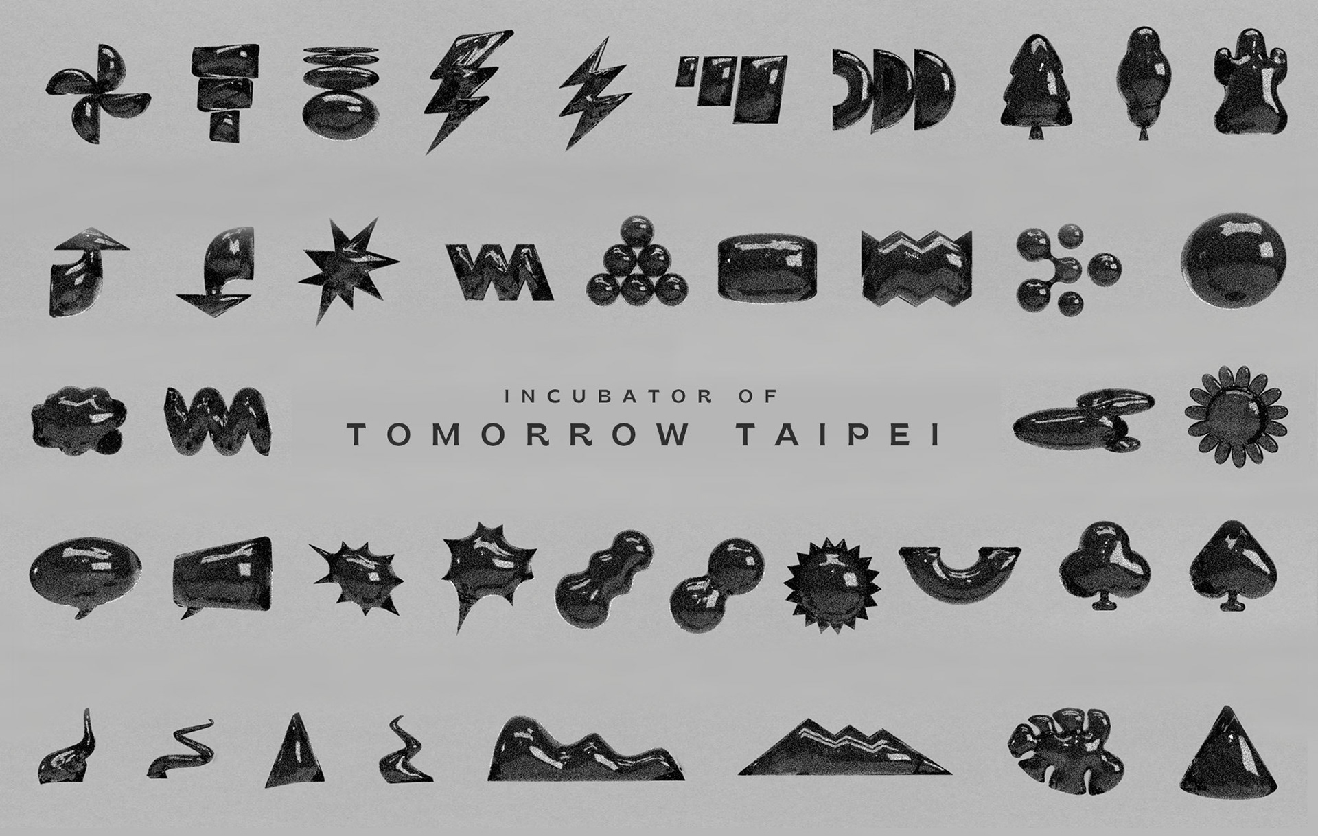
一個強調創意激盪的國際設計平台,就像是一個培育創意細胞成長的培養皿,也意味著主視覺故事的創造,也該是一次混種培養的過程,不單以臺北為基地,也將臺北的混雜細胞放入培養皿中。
我們以「明日培養皿」為設計概念出發,伴隨著不同活動的主旨,培育出不同的主視覺形象。臺北本就是一座混雜且持續演化的城市,設計是明日的基因,主視覺則是演化的進行式。
The key visual design of an event bridges the brand and its audience, shaping a storytelling angle that resonates deeply. An international design platform, like an incubator, nurtures creative cells, with the storytelling process reflecting hybrid incubation. Rooted in Taipei, the platform integrates the city's unique hybrid cells. Using the concept "Incubator of Tomorrow," various key visuals were developed, aligning with different activities. Taipei, a constantly evolving hybrid city, where design is the DNA of the future, reflects the ongoing evolution through key visual design.

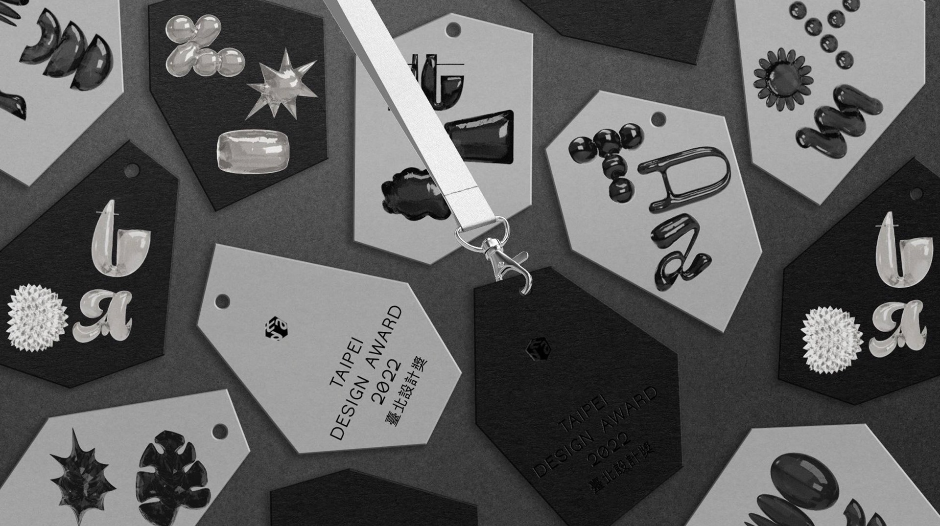
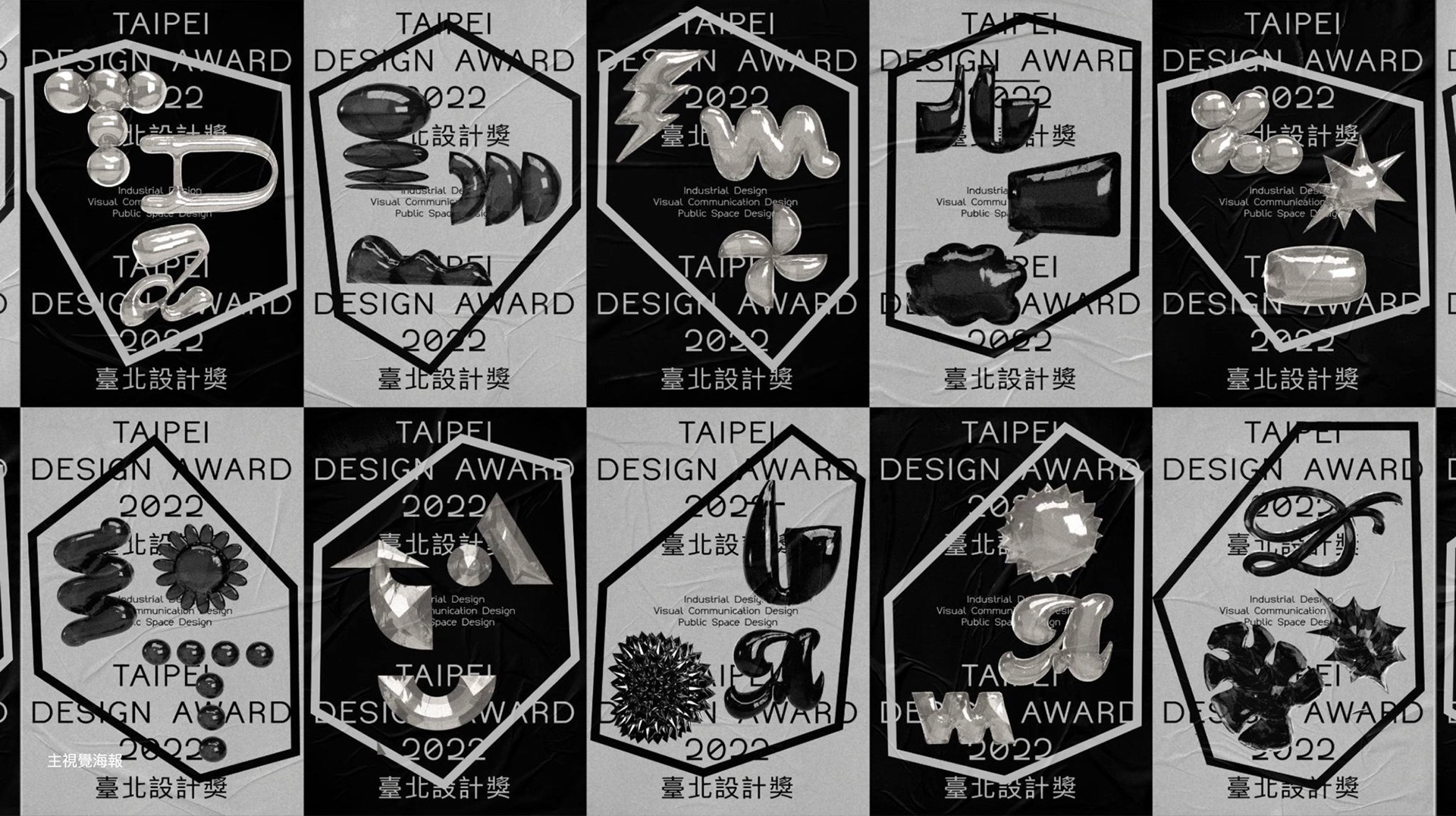
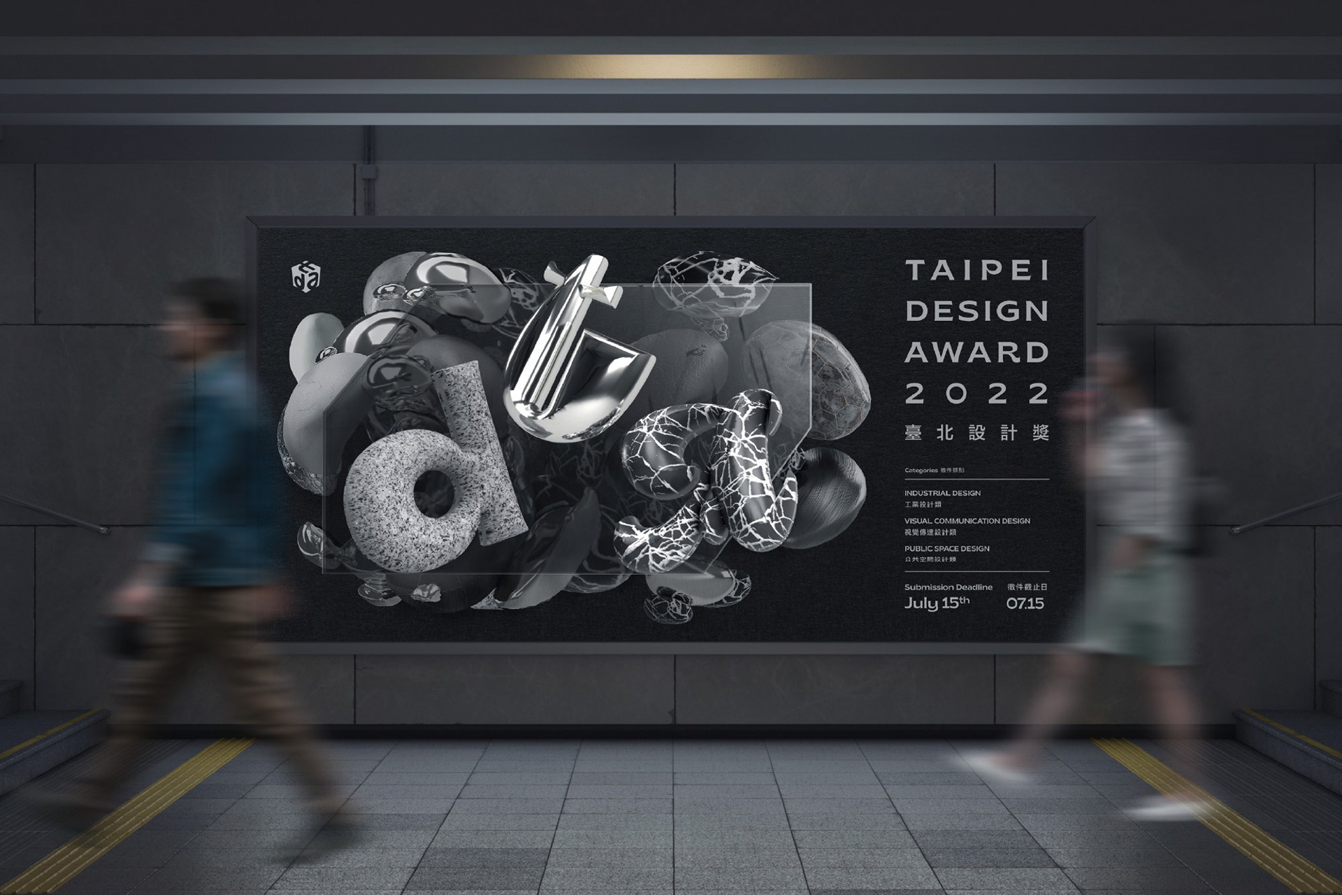
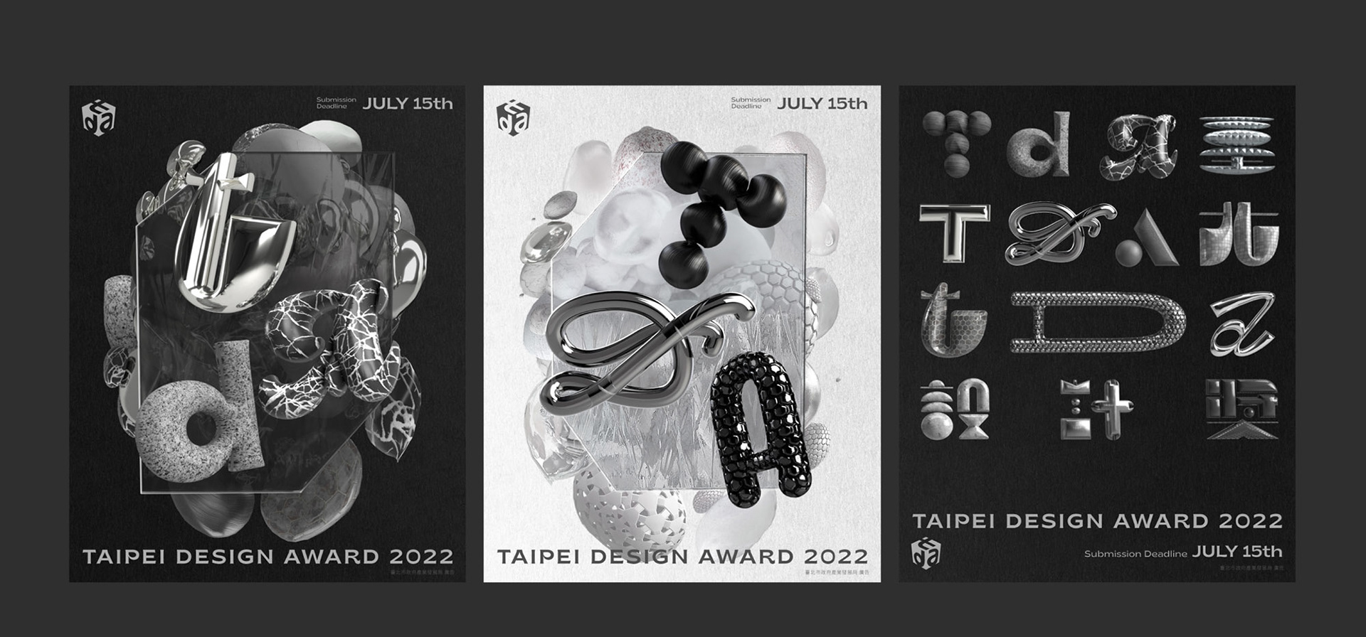
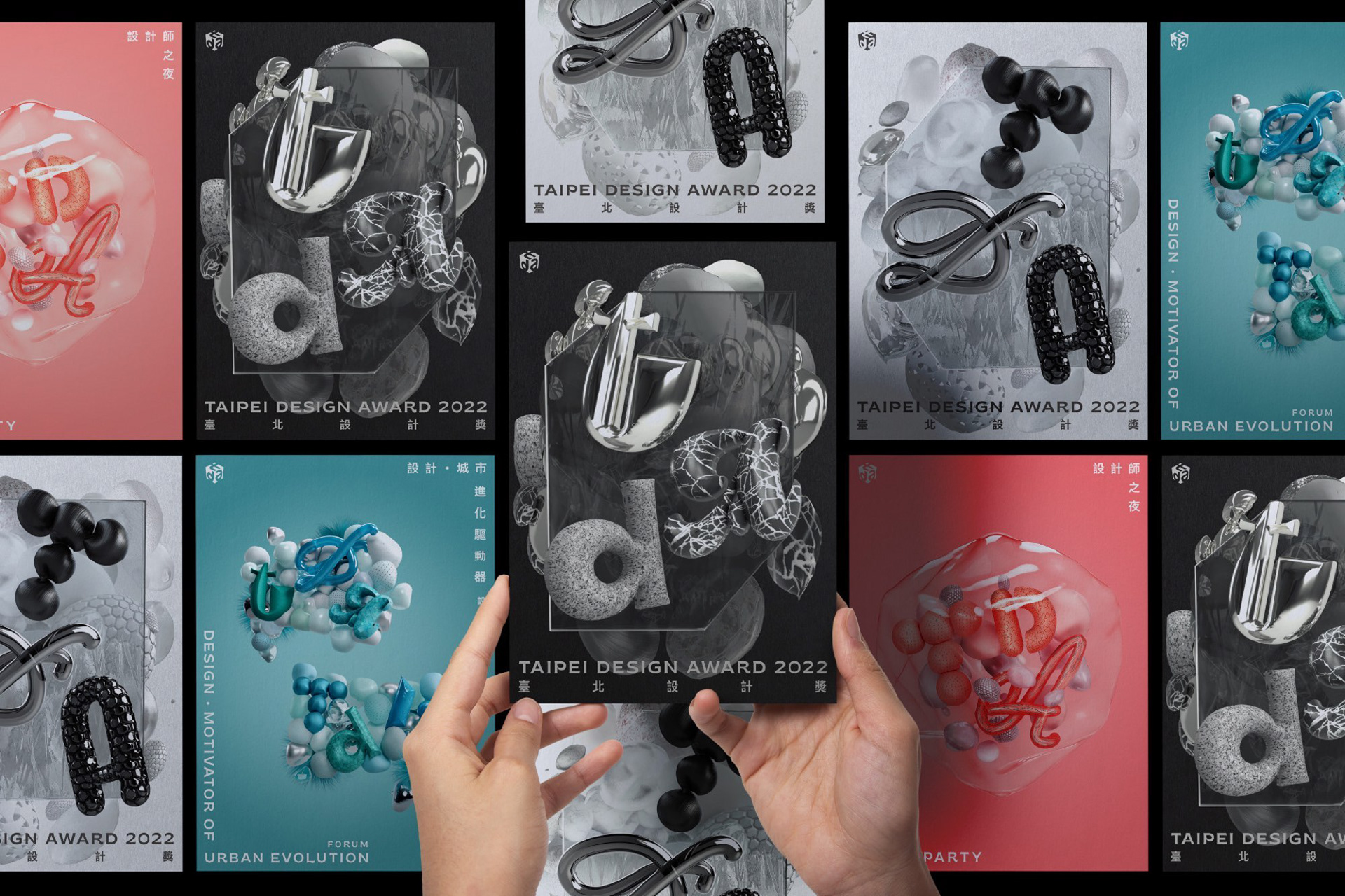
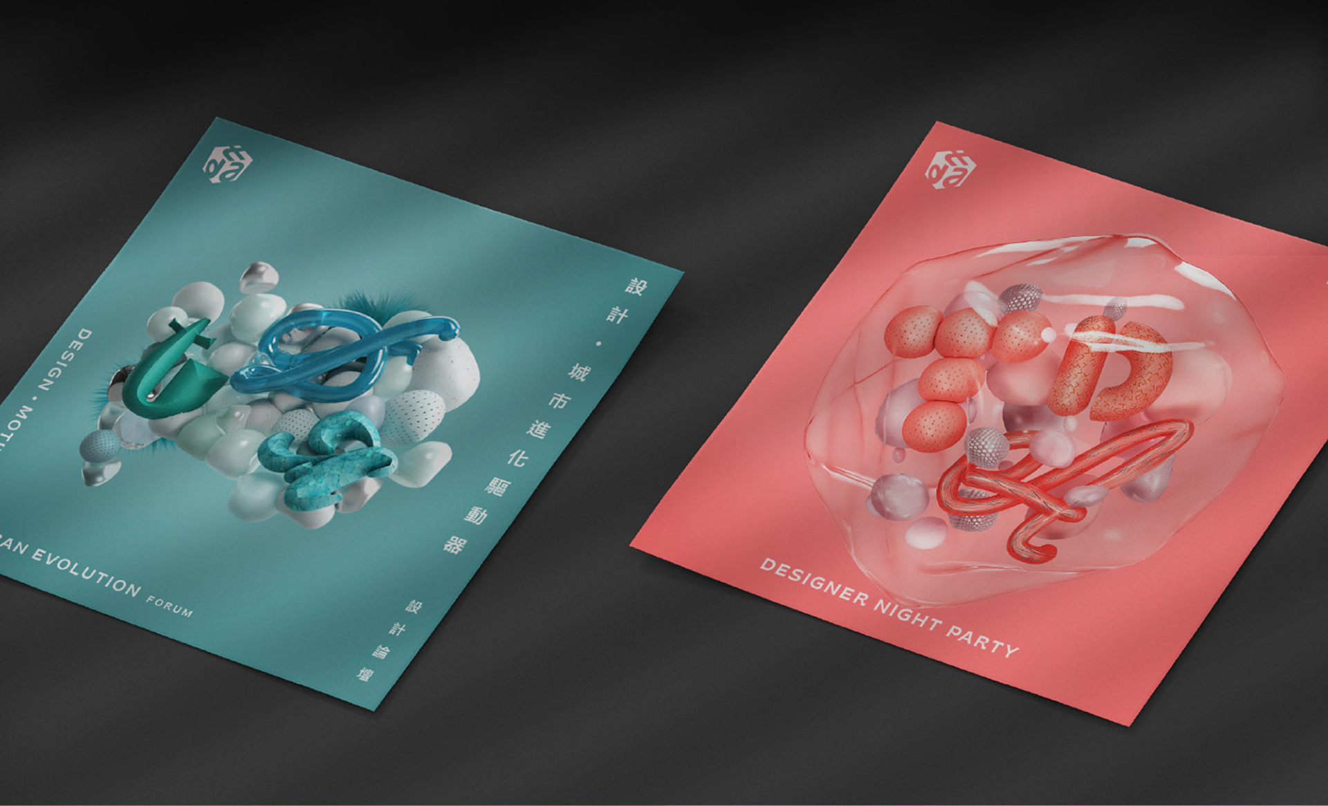
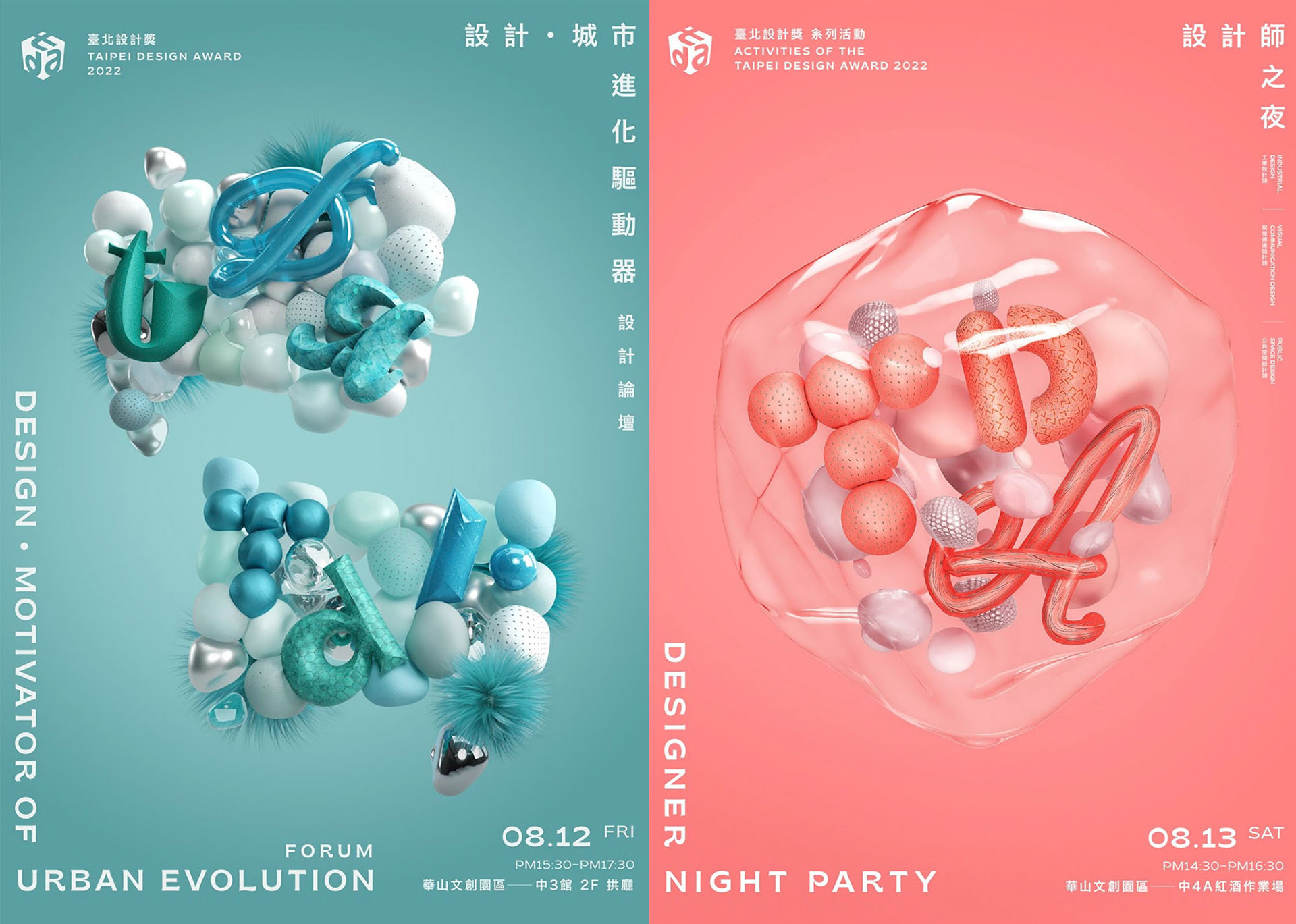
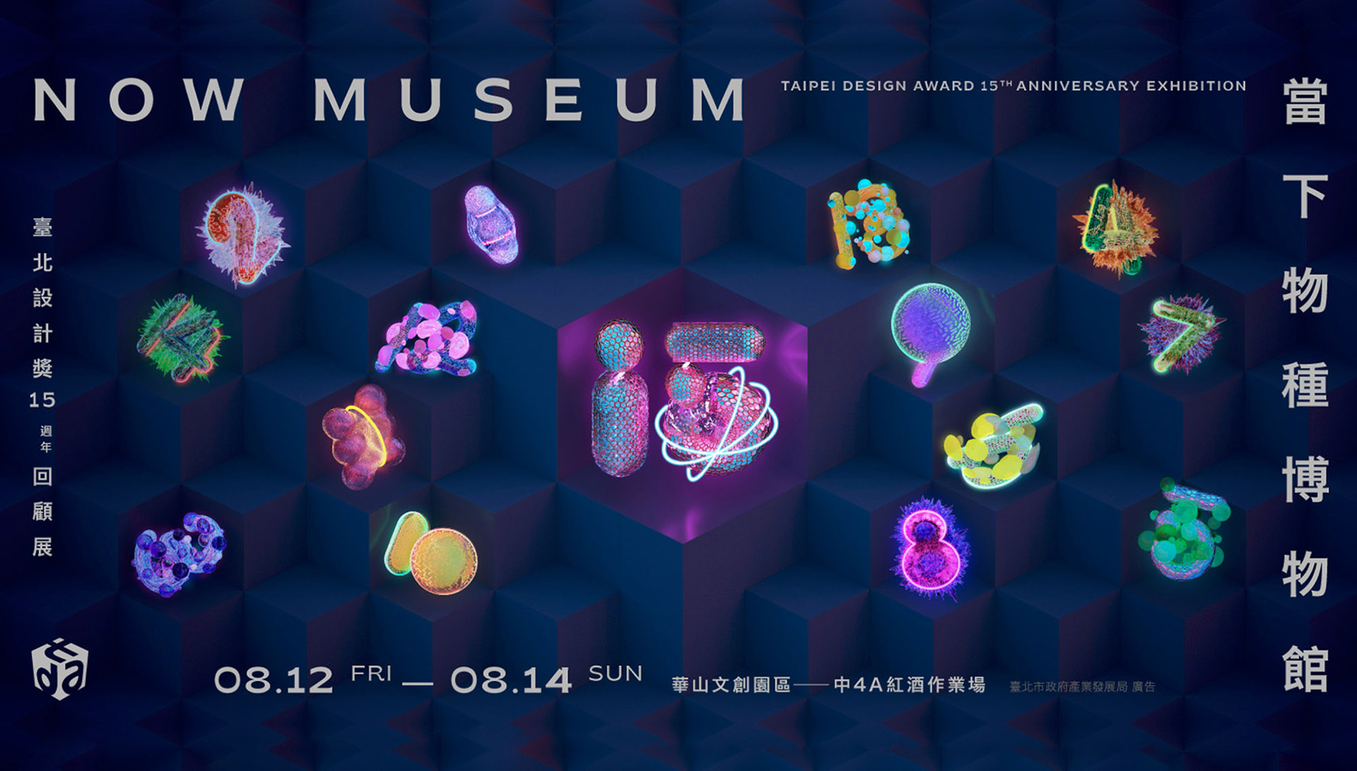
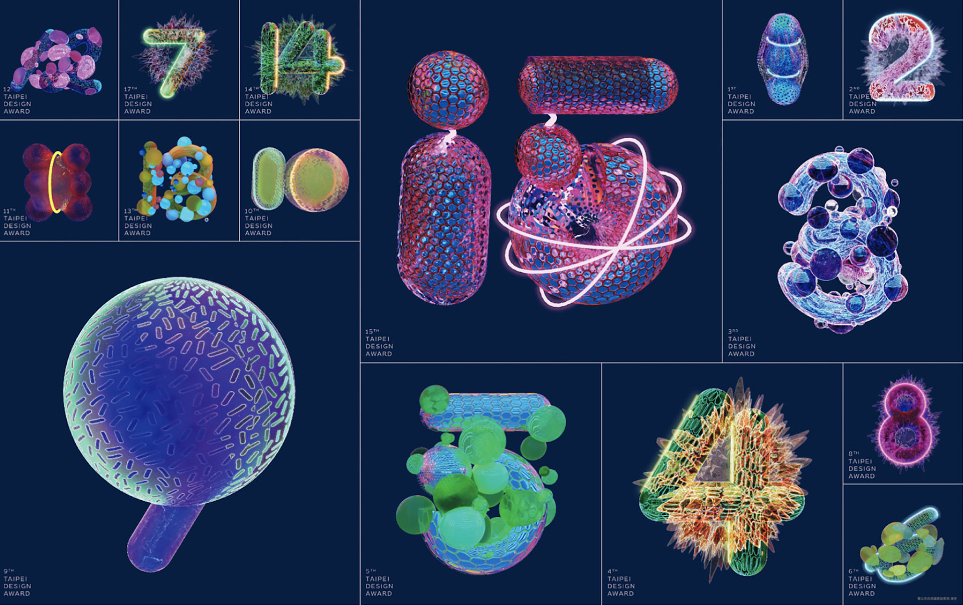
首波黑白雙色主視覺呈現多元細胞的碰撞與演化起點。第二波設計論壇主視覺,透過對話框輪廓展現設計交流的內涵。設計師之夜主視覺採用透明液體包覆細胞,並以桃紅色營造派對氣氛,強調參與者為演化核心。第四波15周年展覽則以15種不同細胞造型,象徵臺北設計獎15年的累積成果與設計展示。
The first phase of the black-and-white key visual introduces cells of various materials and forms, symbolizing the starting point of evolution through their collisions. In the second stage for the Design Forum, clearer cell shapes form dialogue box contours, representing design exchange.
The Designers’ Night visual uses transparent liquid to merge cells into a larger body, with fluorescent pink amplifying the party vibe, emphasizing participants as cores of evolution. The fourth phase for the 15th Anniversary Exhibition features 15 distinct cell forms representing Taipei Design Award's evolution over the past 15 years, highlighting the exhibition theme.
Client 客戶|台北市政府產業發展局、財團法人中國生產力中心
Project|Taipei Design Award Key Visual
Design Agency 設計公司|白輻射影像 WhiteLight Motion
Design Director 設計總監|洪鈺堂 Rex Hon
Creative Director 創意指導|曾傑 Jesse Tseng
Project Manager 專案經理|陳彥瑋 YenWei Chen
Designer 設計|莊騰翔 Teng Hsiang Chuang、石曦璇 Xi Shih
Motion Poster 動態海報|洪瑞晟 JuiCheng Hung、艾林子 LinZi Ai (digital foundry)
Design Agency 設計公司|白輻射影像 WhiteLight Motion
Design Director 設計總監|洪鈺堂 Rex Hon
Creative Director 創意指導|曾傑 Jesse Tseng
Project Manager 專案經理|陳彥瑋 YenWei Chen
Designer 設計|莊騰翔 Teng Hsiang Chuang、石曦璇 Xi Shih
Motion Poster 動態海報|洪瑞晟 JuiCheng Hung、艾林子 LinZi Ai (digital foundry)
Project|Taipei Design Award Ceremony Visual Package
Director 導演|洪鈺堂 Rex Hon
Art Director 藝術總監|洪鈺堂 Rex Hon
Key Visual 主視覺設計|莊騰翔 Teng Hsiang Chuang
Motion Board 動態腳本|陳澤銘Nick Chen
Motion Design 動態設計|陳威廷 Weiting Chen
Composing 合成|陳威廷 Weiting Chen
字體動態|許凱鈞 Kai Chun Hsu
Director 導演|洪鈺堂 Rex Hon
Art Director 藝術總監|洪鈺堂 Rex Hon
Key Visual 主視覺設計|莊騰翔 Teng Hsiang Chuang
Motion Board 動態腳本|陳澤銘Nick Chen
Motion Design 動態設計|陳威廷 Weiting Chen
Composing 合成|陳威廷 Weiting Chen
字體動態|許凱鈞 Kai Chun Hsu