
2026 Taitung Expo Promo - All You Need Is “!”
台東博覽會宣傳影片《台東多一點 》
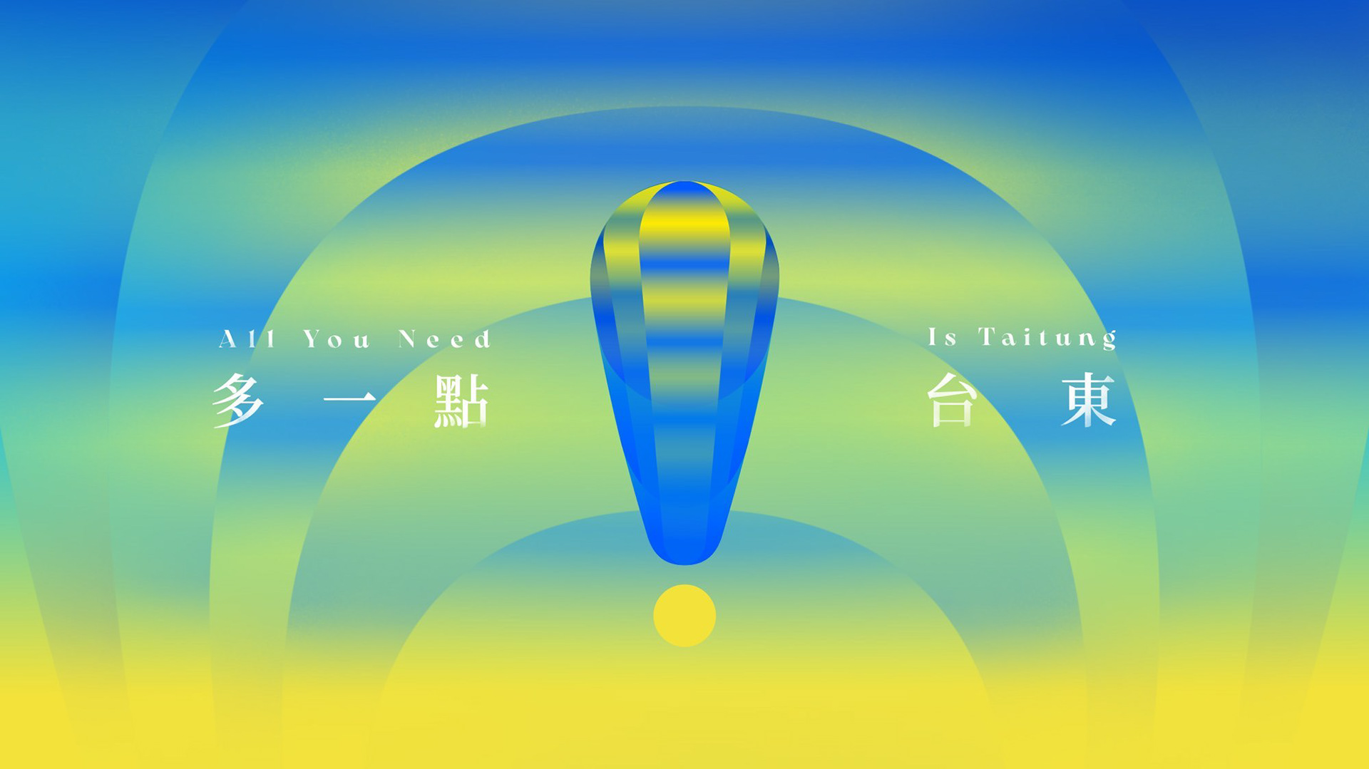
2026年台東博覽會,我們以「台東多一點」為創意核心,將品牌標誌的驚嘆號化作每一個細節的情緒符號,捕捉山海、文化與活動的瞬間驚喜,呈現台東無限可能與感動。
For the 2026 Taitung Expo, we centered on “A Bit More of Taitung”, turning the logo’s exclamation mark into a symbol of emotion in every detail, capturing fleeting moments of surprise across landscapes, culture, and activities, and conveying Taitung’s endless possibilities and delight.
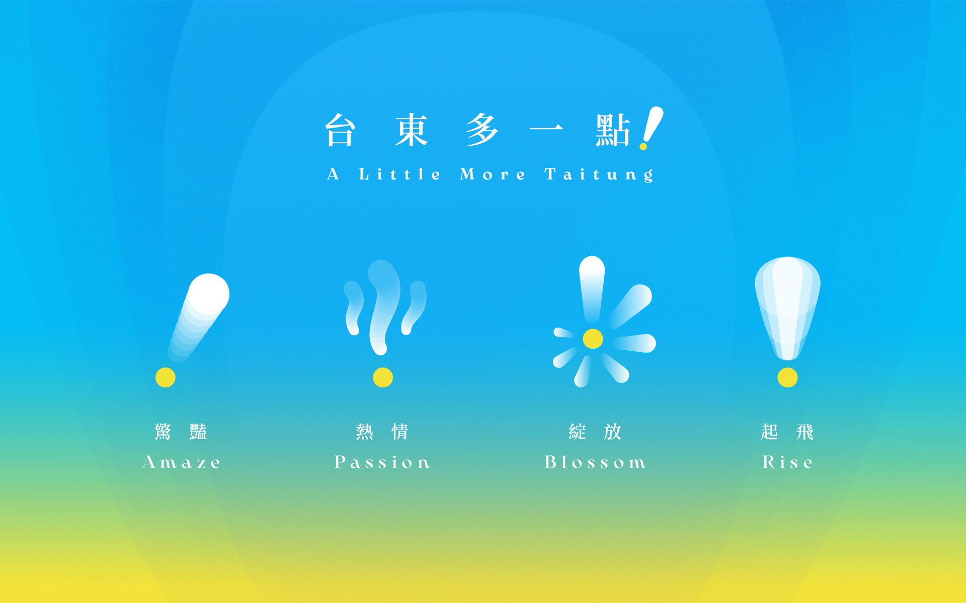
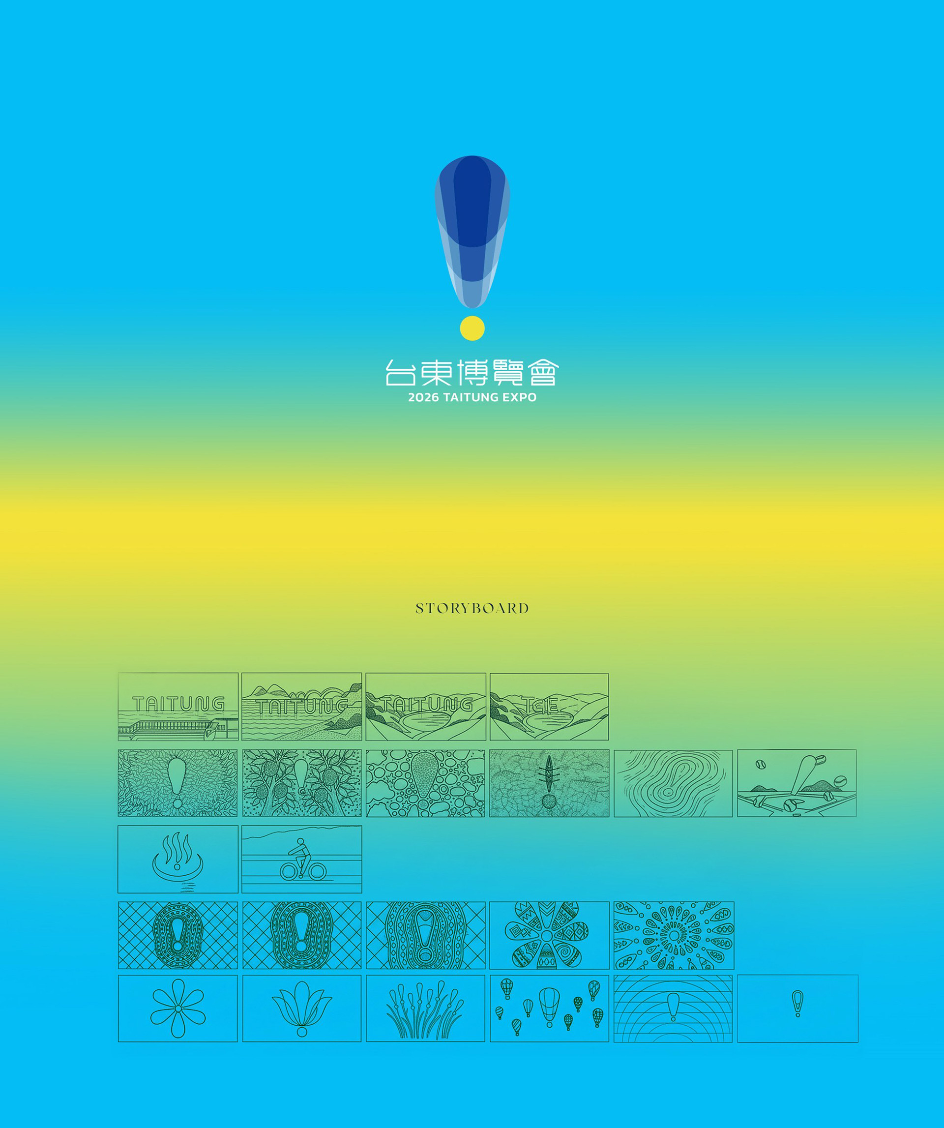
驚嘆號作為台東的召喚
Amazing Taitung: Seen, Heard, Felt
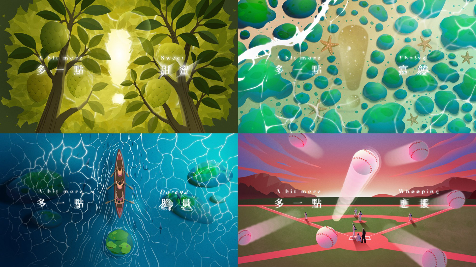
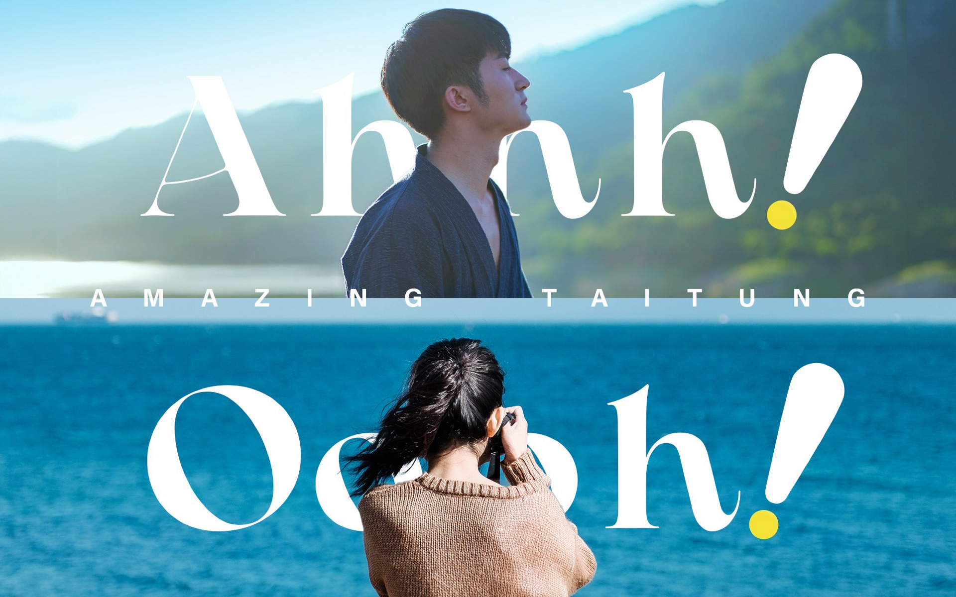
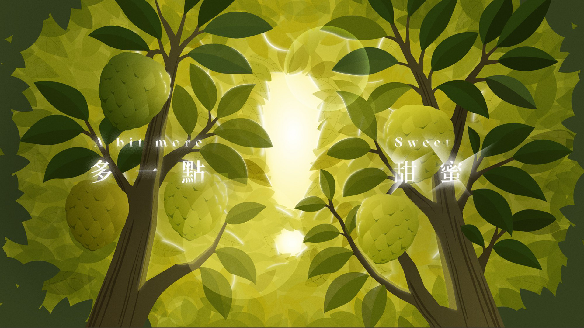
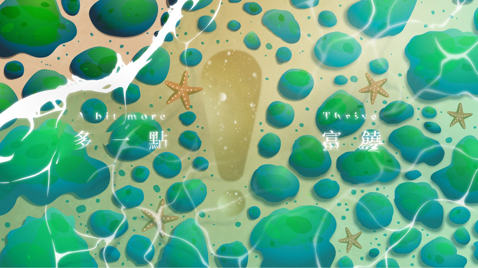
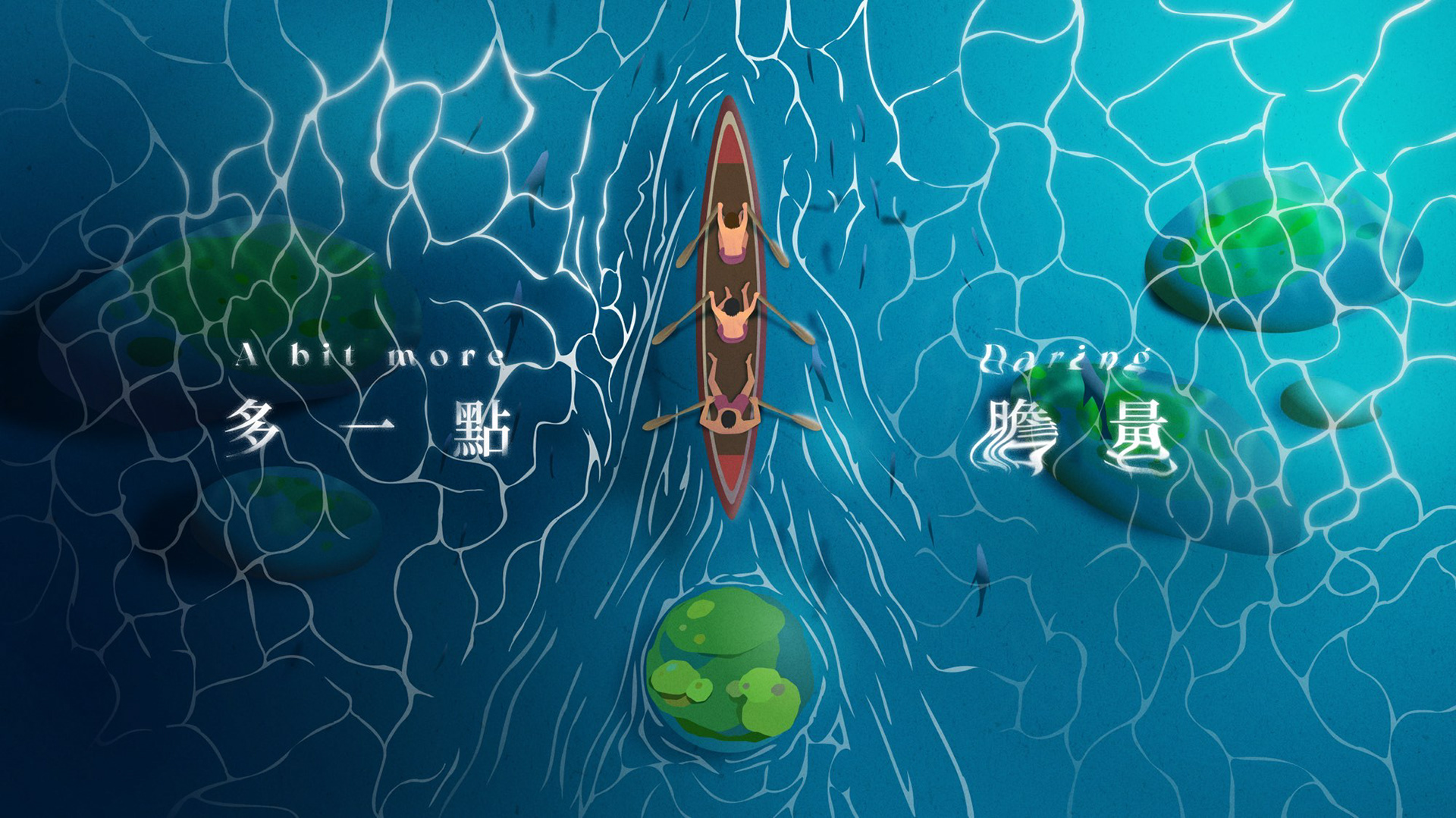
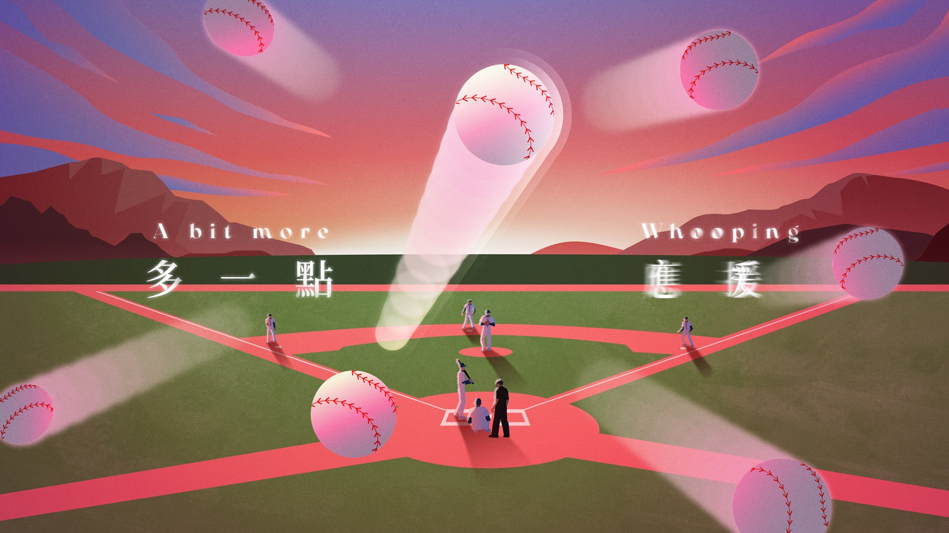
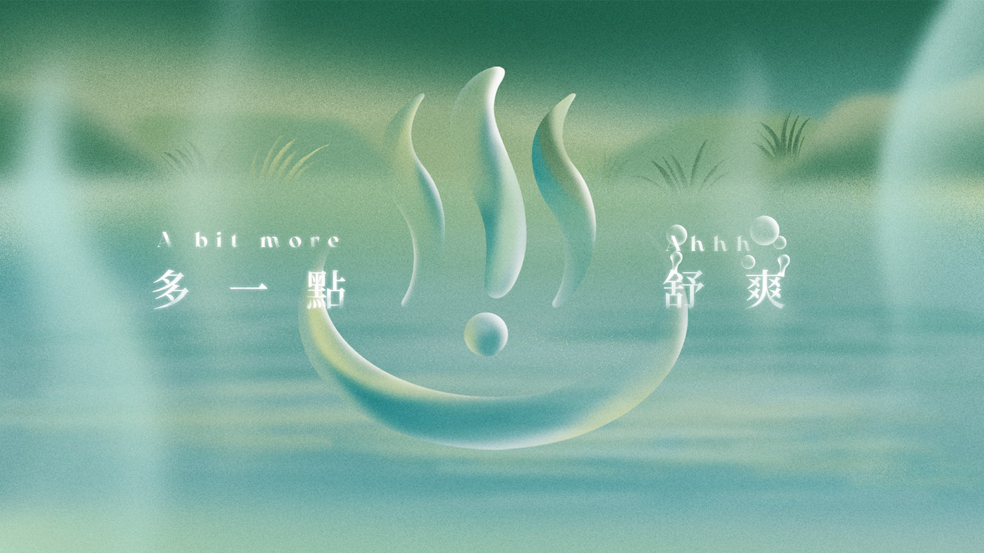
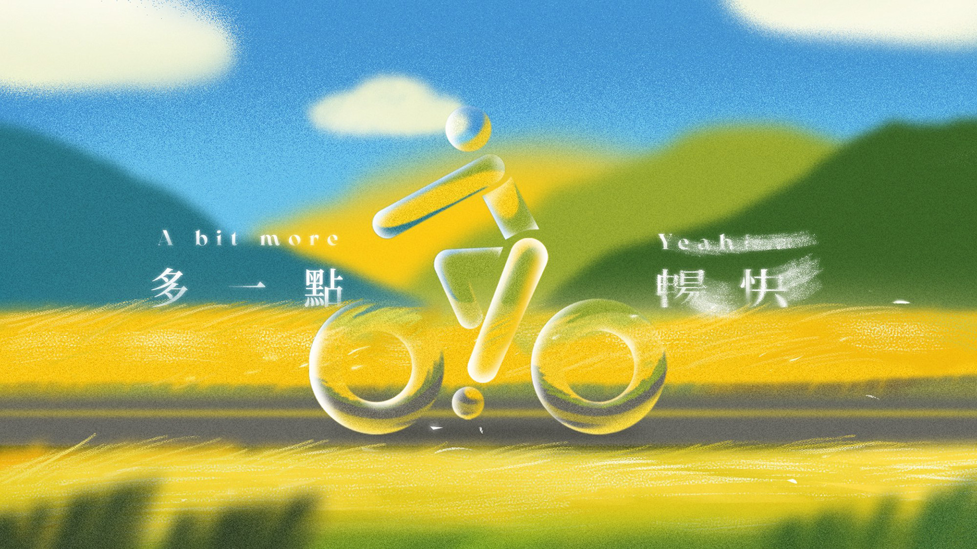
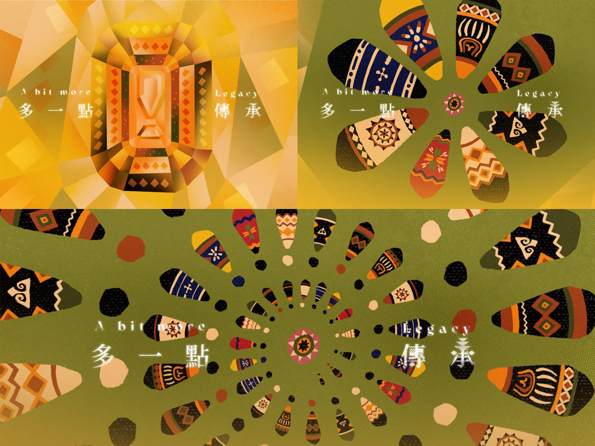
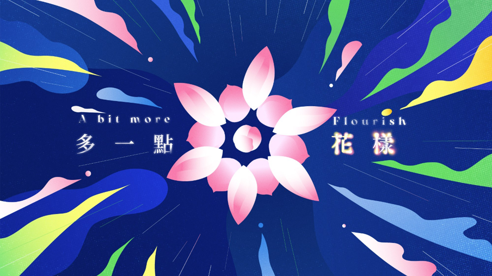
沒有任何一個詞彙能完全囊括台東的樣貌。這裡有山、有海、有歌聲、有神話,也有風味與景致,每一個細節背後,都蘊藏著深厚的故事與感動。我們以「台東多一點」作為創意核心,從品牌標誌的驚嘆號汲取靈感——那簡單的一筆與微小的點,是每一次感受台東無限可能與感動的細微情緒。我們將驚嘆號融入物產、觀光、海洋、山脈、文化與活動之中,象徵著台東在動與靜之間的驚奇與震撼,從微小的「啊」到深刻的「哇」。
No single word can fully capture the essence of Taitung. Here there are mountains and seas, songs and myths, flavors and landscapes—each detail carries deep stories and emotions.
Our creative core, “A Bit More of Taitung”, draws inspiration from the exclamation mark in the brand logo—its simple line and tiny dot reflect every subtle moment of wonder and delight that comes from experiencing Taitung’s endless possibilities. We integrated the exclamation mark across local produce, tourism, oceans, mountains, culture, and activities, symbolizing Taitung’s surprises and awe in both motion and stillness—from the quietest “ah” to the most profound “wow.”

驚嘆號的延伸:影像與聲音的雙重敘事
Exclaim Taitung!
從農業果樹間透出的光影、海岸線的生機、棒球場的熱力,到啟航船隻與礁石的律動,每個場景都呼應驚嘆號的姿態。驚嘆號同時也象徵訪客的心情:是溫泉蒸氣的舒暢,是自行車風馳的暢快。透過設計,我們讓驚嘆號不只是視覺符號,更是感官與情緒的具象呈現,它既能代表台東漢人與原住民文化的共榮繽紛,也能化作月桃花綻放與稻穗搖曳的姿態。
From the light and shadows among orchard trees, the vitality along the coastline, the energy of baseball fields, to the rhythm of sailing boats and reefs, every scene echoes the gesture of the exclamation mark. It also embodies the mood of visitors: the soothing comfort of hot spring steam, the exhilaration of cycling with the wind. Through our design, the exclamation mark becomes more than a visual symbol—it manifests as a sensory and emotional experience. It represents the vibrant coexistence of Han and Indigenous cultures, while also capturing the gestures of blooming shell ginger flowers and swaying rice stalks.


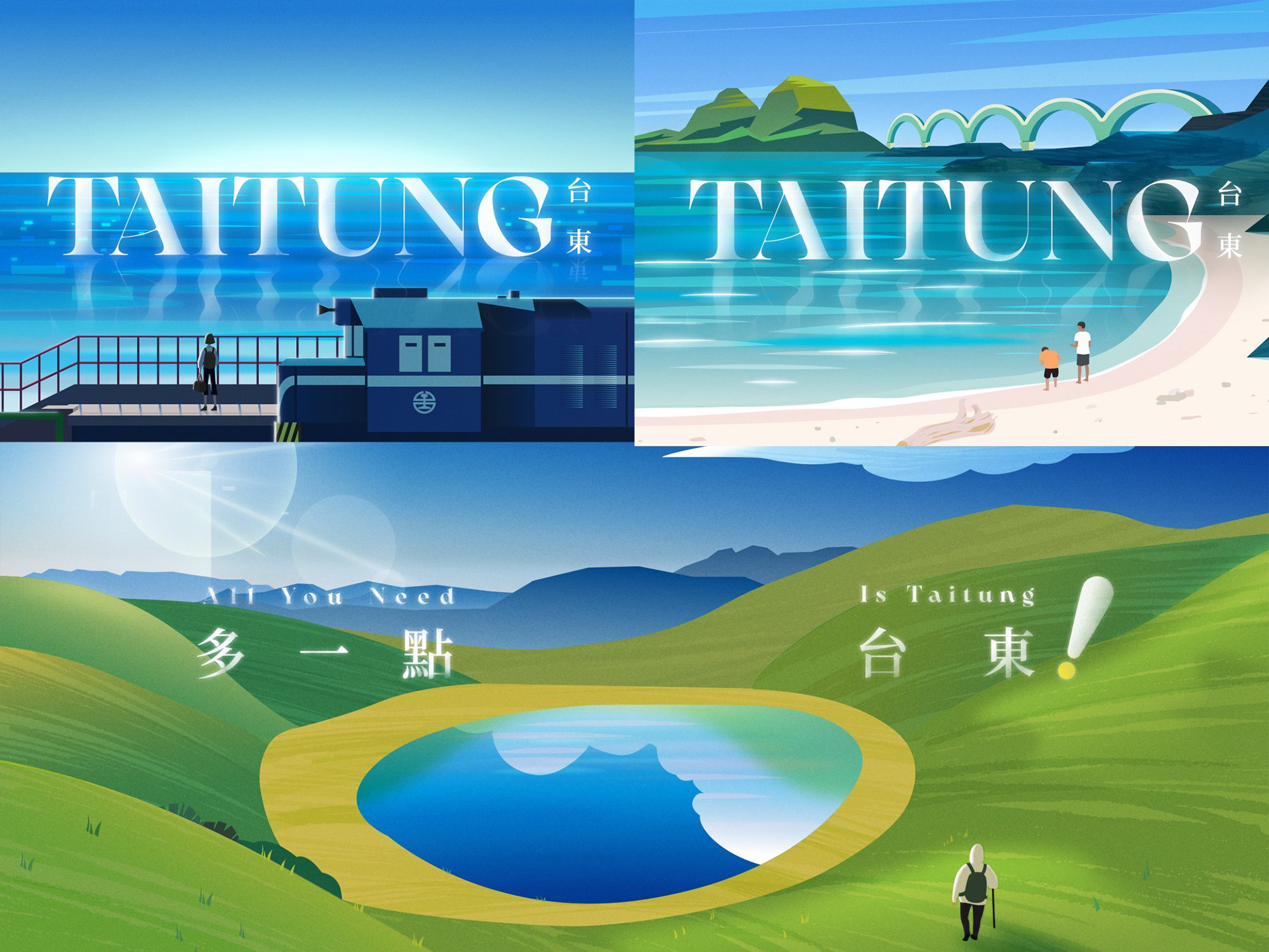


每一個鏡頭都是一幅有生命的視覺,呼應「多一點」的多重含義。作為台東博覽會的起點,我們透過動態影像邀請所有參與者來到台東,帶走一份記憶與感動——多一點,就成了驚嘆號;台東的精彩,從不止一點,總讓人想再多一點。
Each frame is a living visual, reflecting the multiple layers of “a bit more.” As the starting point of the Taitung Expo, our dynamic visuals invite every participant to Taitung, taking away memories and emotions—a little more, and it becomes an exclamation mark. The wonders of Taitung are never just a little; they always leave you wanting a bit more.


CREDIT
博覽會總策畫 Expo PCM:玩美文創 Wonderful Design Studio
標誌設計 Logo Design:玩美文創 Wonderful Design Studio
影像製作 Production|白輻射影像 WhiteLight Motion
專案經理 Project Manager|詹智強 Jim Chan
創意總監 Creative Director|曾傑 Jesse Tseng
導演 Director|洪鈺堂 Rex Hon
分鏡設計 Storyboard|莊騰翔 Teng Hsiang CHUANG
美術設計 Styleframe|Aastalim、石曦璇 Xi Shih
動態設計 Motion Design|莊仲凱 Kyle Jhuang
音樂設計 Music & Sound Design |質地有聲製樂所 Audio Textural - 許家維 Hsu Chia-Wei