

公共電視於 2017 年成立串流品牌「PTS+」,平台藉由服務臺灣多語族群、聚焦公共觀點及擴大閱聽視野,打造臺灣本土第一 OTT 品牌。 在 PTS+創立六週年之際,除了推出全新的網站服務,提供會員全新的使用體驗、便捷節目檢索功能外,更全面打造全新的 CIS 企業識別系統,傳達新概念、 新思維與會員,呼應公視今年將數位轉型作為首要任務。
我們榮幸與公視共同攜手透過品牌重塑工程界定 PTS+與母品牌之間的關係,最終提煉「解碼數位視野」爲其核心精神,概念企圖反映 PTS+兼容影音娛樂「內容力」及公共影視「影響力」兩大特質;突顯商業串流平台當道的今日,PTS+滿足肩負文化使命的公共數位內容缺口的市場定位。
我們榮幸與公視共同攜手透過品牌重塑工程界定 PTS+與母品牌之間的關係,最終提煉「解碼數位視野」爲其核心精神,概念企圖反映 PTS+兼容影音娛樂「內容力」及公共影視「影響力」兩大特質;突顯商業串流平台當道的今日,PTS+滿足肩負文化使命的公共數位內容缺口的市場定位。
Public Television Service Foundation (PTS) established its streaming brand "PTS+" in 2017, aiming to serve Taiwan's multicultural community, focus on public perspectives, and broaden viewers' horizons, making it the first local OTT brand in Taiwan. On the occasion of PTS+'s sixth anniversary, in addition to launching a new website service that provides members with a fresh user experience and convenient program search function, a comprehensive Corporate Identity System has been created to convey new concepts and thinking to the members, echoing PTS's primary mission of digital transformation this year.
We are honored to collaborate with PTS in defining the relationship between PTS+ and its parent brand through the rebranding project, ultimately encapsulating the core spirit of "Decoding the Digital Vision." The concept aims to reflect the two major attributes of PTS+: the "Content Power" of audiovisual entertainment and the "Influence" of public film and television. It highlights the dominance of commercial streaming platforms today while positioning PTS+ as a market leader in fulfilling the cultural mission and addressing the gap in public digital content.
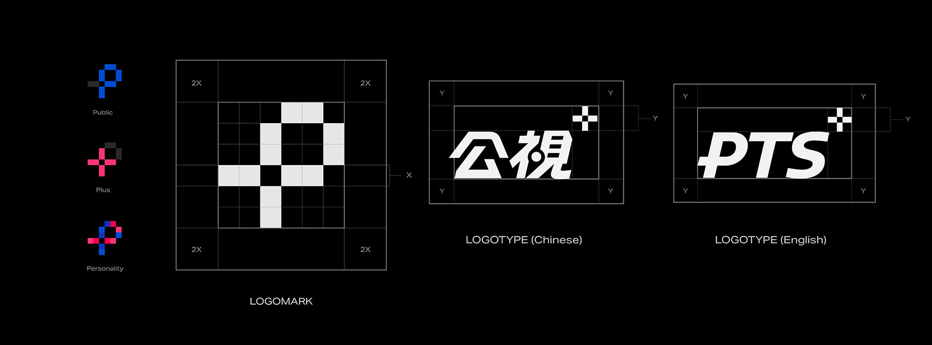
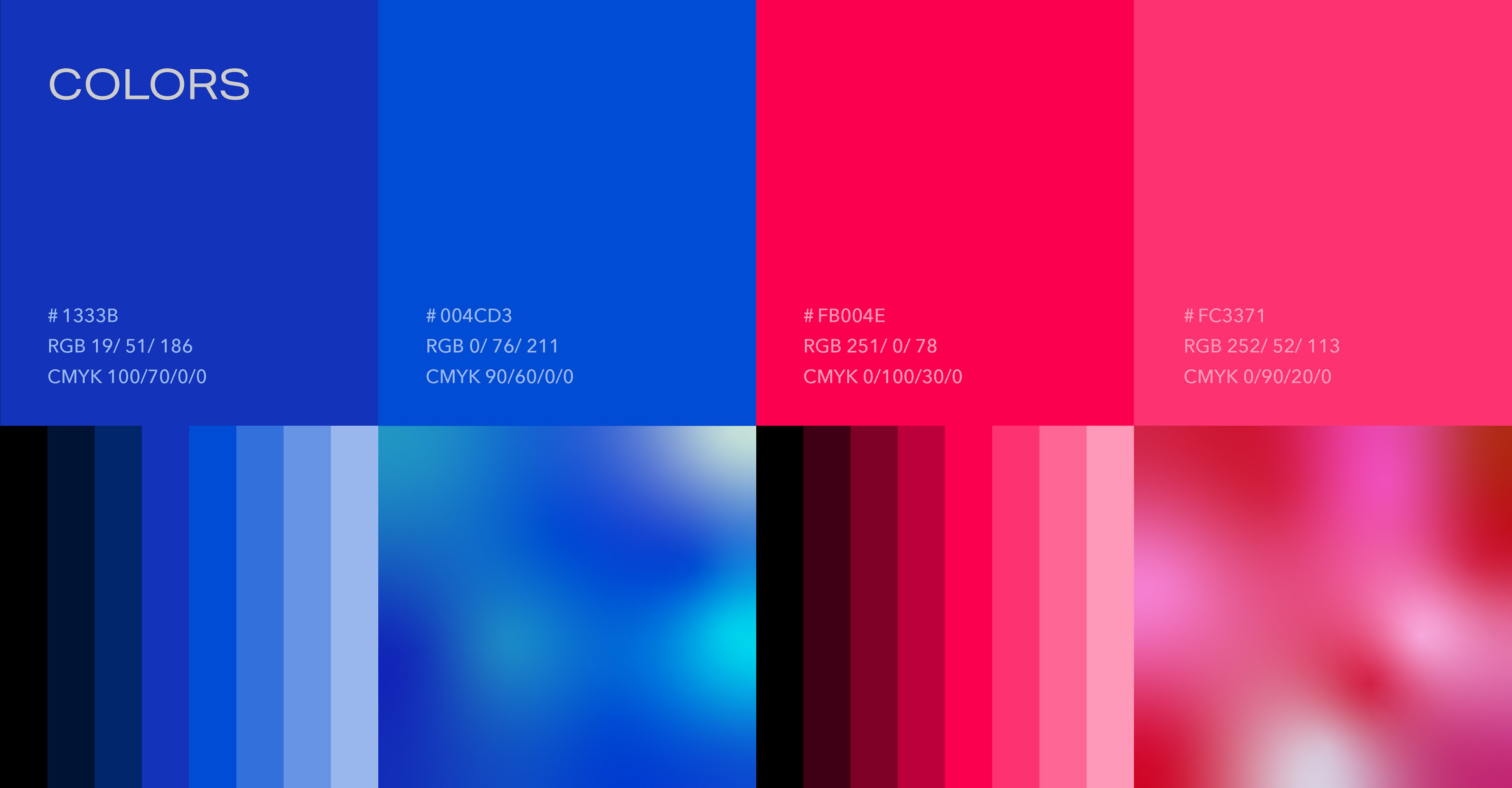
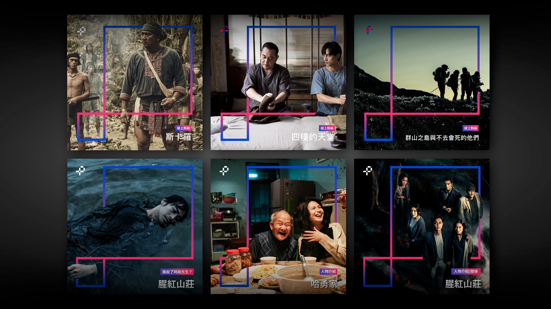
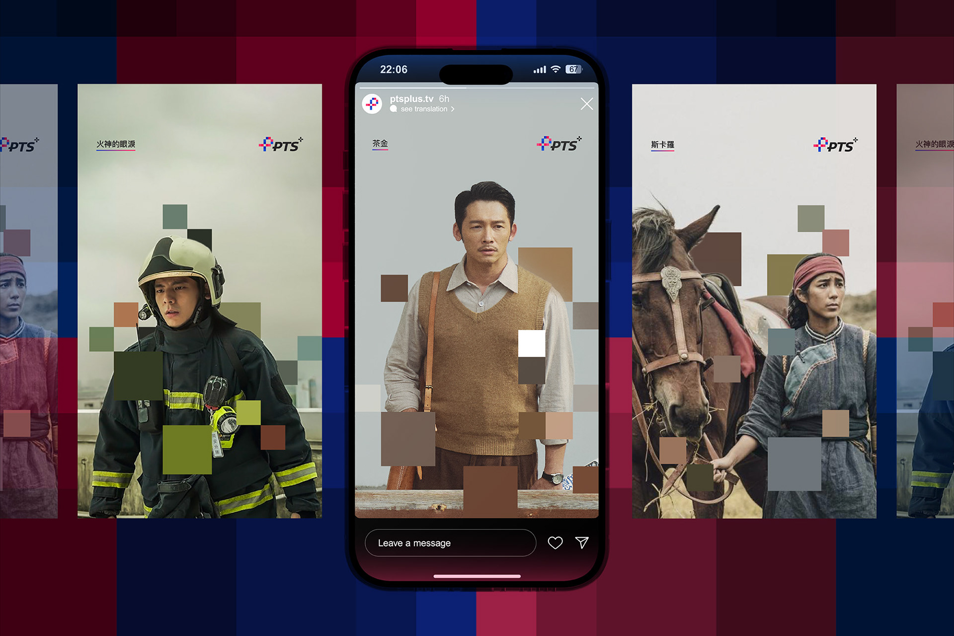
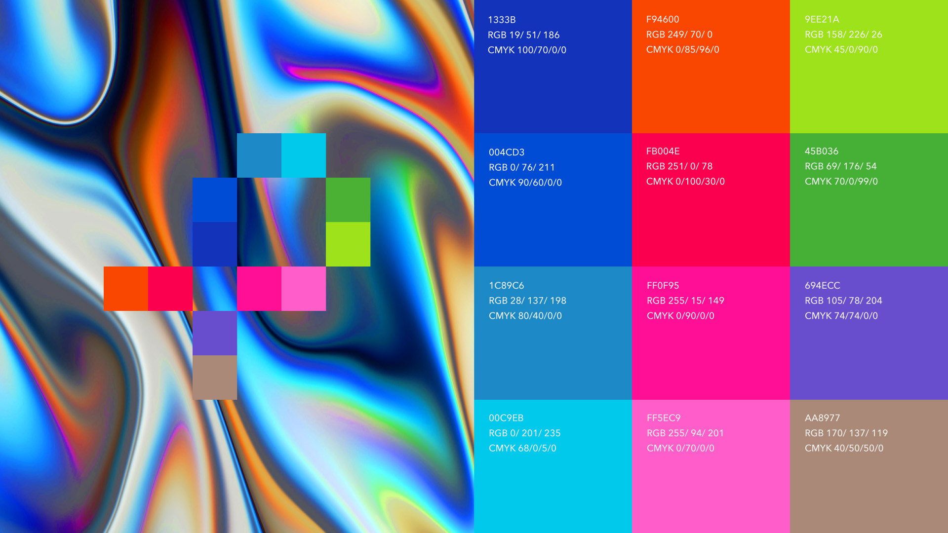
我們將品牌字首「P」及象徵數位延伸的「+」融合為重塑後的 Logomark,並由數位影像最基本單位的「像素」組成。符號蘊含著象徵對焦的取景框造型,意指 PTS+關注多元且深刻的影像文本,引領觀眾凝視議題;同時方格由小放大,象徵PTS+平台內容具備的公共特質,涵蓋微觀議題至宏觀潮流。色彩計畫則擷取母品牌公共電視頻道標誌中的紅藍色特徵,反映著品牌重塑後的升級,來自原有母品牌中的養分基礎。
We have merged the initial letter "P" of the brand with the symbol of digital extension, represented by "+," to create the redesigned logomark, composed of pixels, the fundamental unit of digital imagery.The symbol incorporates a framing shape that represents focus, indicating that PTS+ pays attention to diverse and profound visual narratives, guiding viewers to engage with issues. At the same time, the grid expands from small to large, symbolizing the public nature of the content on the PTS+ platform, covering both micro-level topics and macro-level trends.
The color scheme draws from the red and blue characteristics of the parent brand's logo for Public Television channel, reflecting the brand's upgraded identity after the revitalization, derived from the nourishing foundation of the original parent brand.
The color scheme draws from the red and blue characteristics of the parent brand's logo for Public Television channel, reflecting the brand's upgraded identity after the revitalization, derived from the nourishing foundation of the original parent brand.

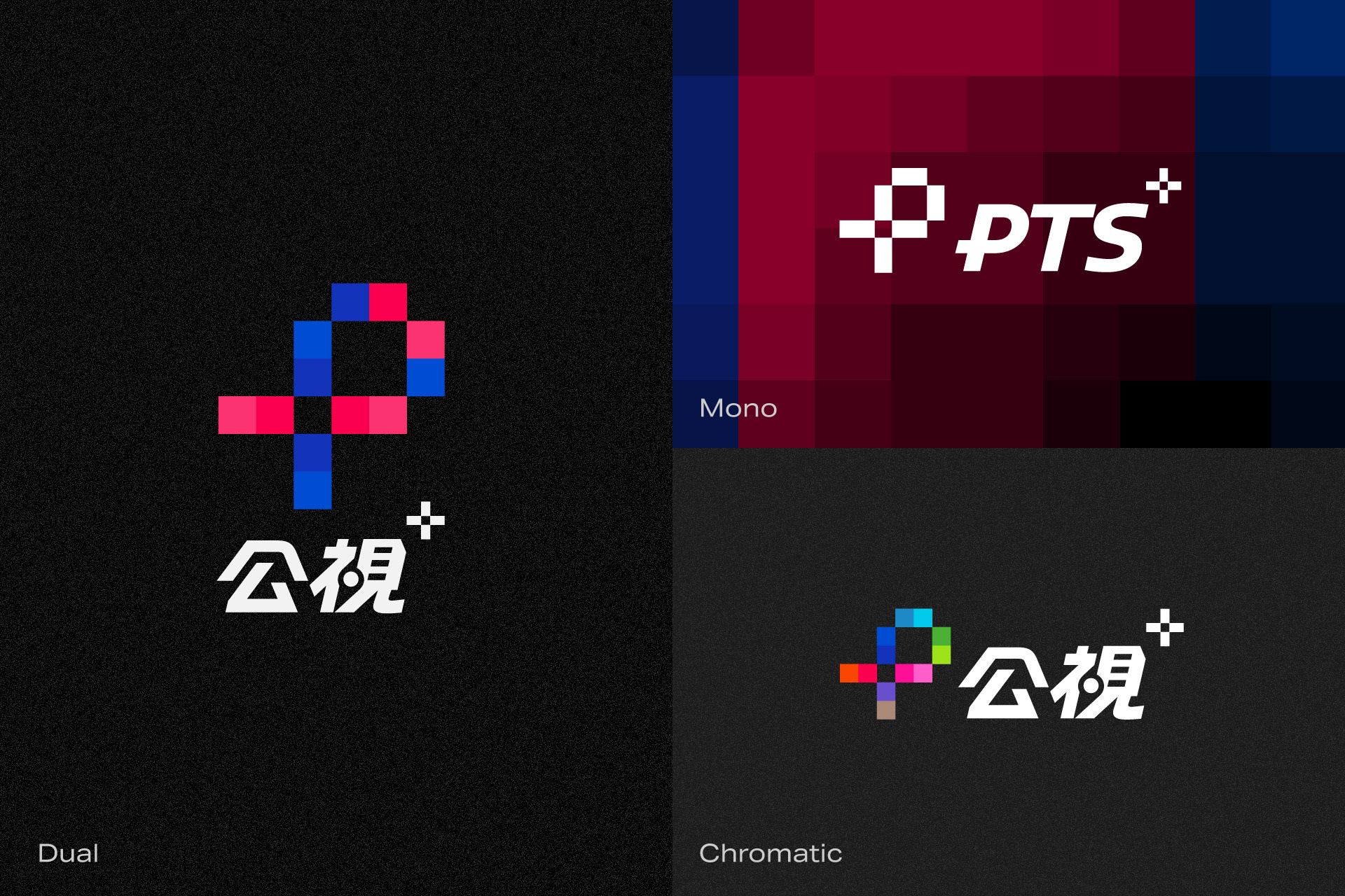
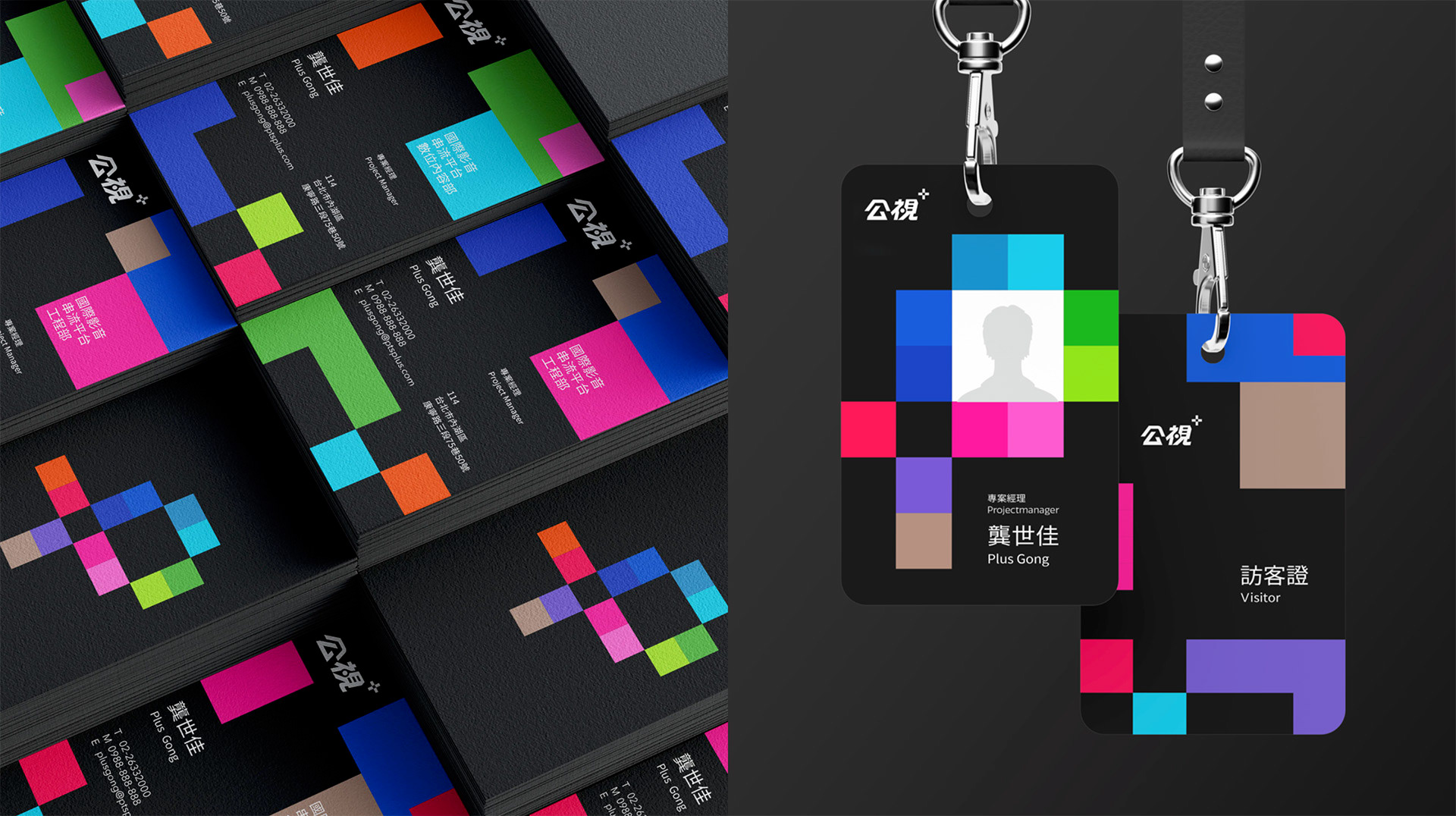
企業識別系統是營運組織面對特定對象的身份外衣,透過品牌家族的設計思考,界定各品牌家族成員的市場定位,反映 品牌面對不同市場需求所提供的業務與服務差異。PTS+ 品牌不僅面向觀眾、同時也面向產業,是打造影視內容的幕後推手。
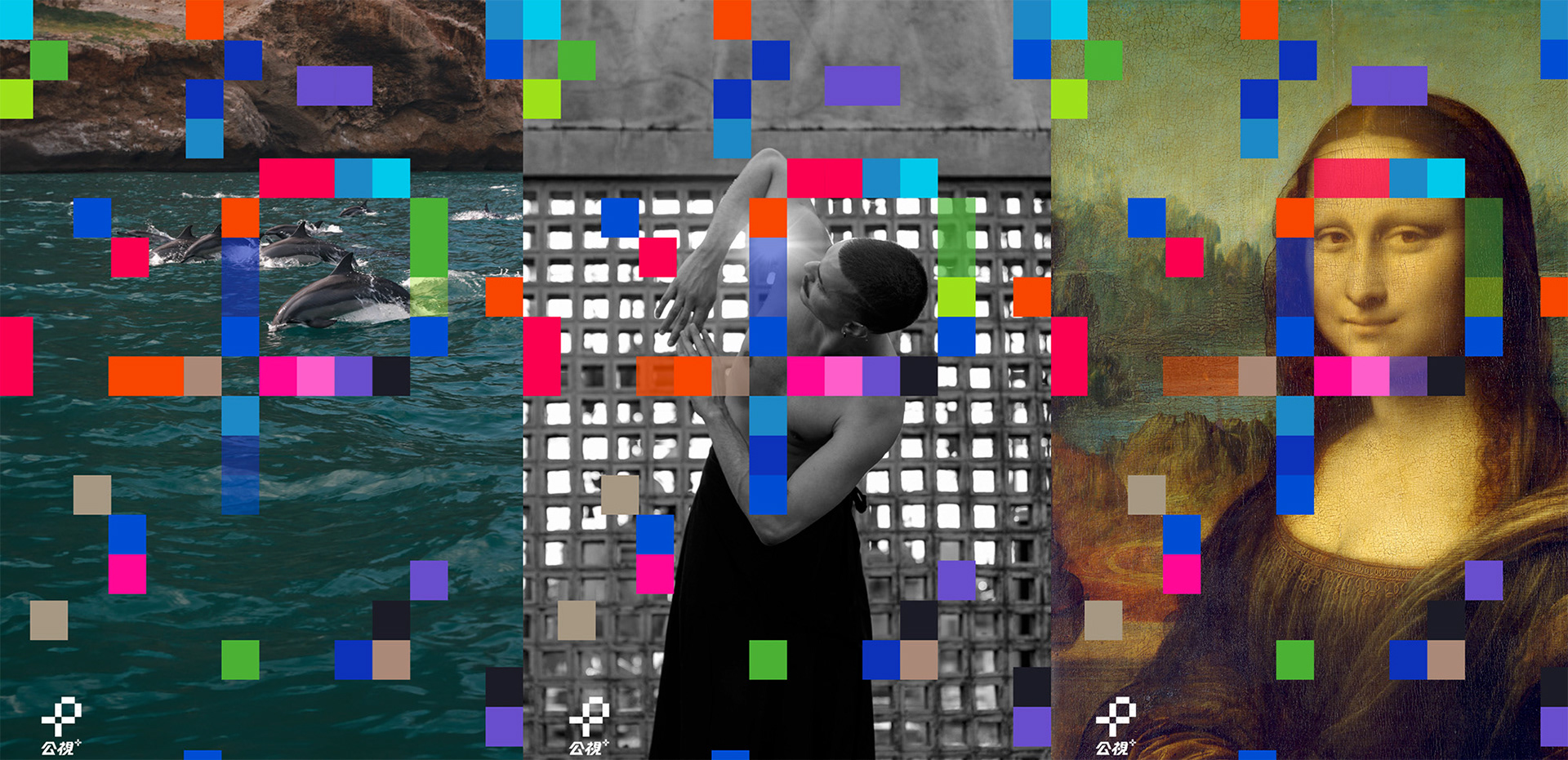
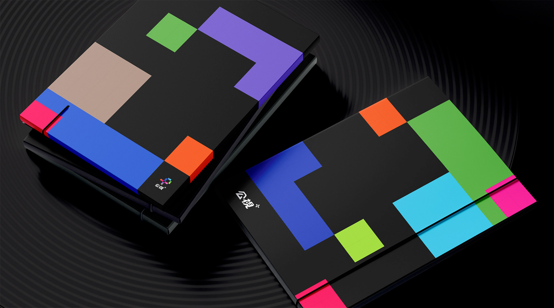
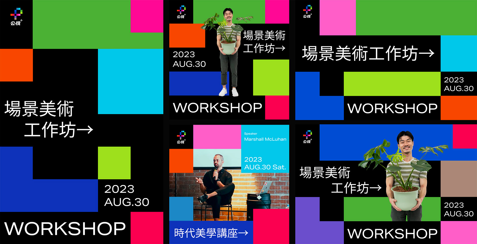
在品牌重塑歷程中,白輻射針對串流平台 B2C 定位設計紅藍雙色版(Dual)識別; 另外延伸繽紛版(Chromatics)建立 PTS+在影視傳播產業、機構(B2B)中重要角色的另一身份,應用於部門識別、工作坊、推廣計畫等重要商務場景。多彩 像素色塊代表熱愛影視創作的夥伴,各方好手凝聚文化力量,共同蓄積公共觀點的能量。
Corporate Identity System serves as the outer garment of an operational organization, defining the market positioning of each brand family member through the design thinking of the brand family. It reflects the business and service differences provided by the brand in response to different market demands.The PTS+ brand not only targets viewers but also the industry, acting as a driving force behind film and television content creation.
In the process of brand revitalization, the red-blue Dual version was designed for the B2C positioning of the streaming platform. Additionally, the Chromatics version was extended to establish another identity for PTS+ as an important player in the film and television communication industry and institutions (B2B). It is applied in departmental identification, workshops, promotional projects, and other important business scenarios. The colorful pixel blocks represent the passionate partners in film and television creation, where various talented individuals gather the power of culture, collectively accumulating the energy of public perspectives.
In the process of brand revitalization, the red-blue Dual version was designed for the B2C positioning of the streaming platform. Additionally, the Chromatics version was extended to establish another identity for PTS+ as an important player in the film and television communication industry and institutions (B2B). It is applied in departmental identification, workshops, promotional projects, and other important business scenarios. The colorful pixel blocks represent the passionate partners in film and television creation, where various talented individuals gather the power of culture, collectively accumulating the energy of public perspectives.
CREDIT
Client:財團法人公共電視文化事業基金會 Public Television Service Foundation
Creative Agency:白輻射影像 Whitelight Motion
專案經理 Project Manager:何若樸 Philip Ho
創意總監 Creative Director:曾傑 Jesse Tseng
藝術總監Art Director:洪鈺堂 Rex Hon
主設計師 Design Lead:莊騰翔 Teng Hsiang CHUANG
平面設計 Designer:莊皓 Hao Zhuang、鄒昀達 Tzou YunDa
Creative Agency:白輻射影像 Whitelight Motion
專案經理 Project Manager:何若樸 Philip Ho
創意總監 Creative Director:曾傑 Jesse Tseng
藝術總監Art Director:洪鈺堂 Rex Hon
主設計師 Design Lead:莊騰翔 Teng Hsiang CHUANG
平面設計 Designer:莊皓 Hao Zhuang、鄒昀達 Tzou YunDa